Am I the only one who hates automatic drop-down navigation menus? You know, the kind where as soon as your mouse moves across the top bar of the web site, a bunch of links appear below it? I hate them because nine times out of ten, I’m not interested in navigating anywhere, I’m just moving my mouse from the browser’s address bar down to something on the page. But as soon as my cursor moves past the navigation bar, a bunch of crap shows up and blocks my view of the actual content of the page, which is what I actually want to look at. I actually prefer if I have to click on a menu to make it drop down. I’m not such an invalid that I can’t click my mouse button.
Today’s pet peeve was brought to you by paypal.com, verizonwireless.com, and a whole host of others.
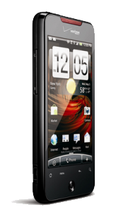
 I got sick of my Droid Eris draining its battery and lagging all the time, so I upgraded early (via Craig’s List) to a Droid Incredible. It’s likely to have similar problems eventually since it’s also made by HTC, but it starts out with a faster processor, a newer version of Android, and a lot more storage space, so it should take longer to become obnoxious. My favorite feature of my “new” phone is that the camera has a flash; that should help make it a little more useful as a camera.
I thought about getting a non-HTC Android phone instead, but I honestly can’t get away from HTC’s enhancements for Android. Their mail client alone is worth dealing with their crummy phone book. And they really have made great strides from Android 2.1 to 2.2, an upgrade which the Eris would never receive.
This will at least tide me over until August, when I’m up for a real upgrade, and there should be a slew of 4G/LTE phones available.
![[papertowel.org]](http://papertowel.org/smallpapertowel.gif)
 I got sick of my Droid Eris draining its battery and lagging all the time, so I upgraded early (via Craig’s List) to a Droid Incredible. It’s likely to have similar problems eventually since it’s also made by HTC, but it starts out with a faster processor, a newer version of Android, and a lot more storage space, so it should take longer to become obnoxious. My favorite feature of my “new” phone is that the camera has a flash; that should help make it a little more useful as a camera.
 All text, code, and images within this site are distributed with a